CSS Responsive กับ โจทย์แต่ละแบบ
ทีนี้เราจะลองมาดู CSS Responsive กันบ้าง
ใน CSS เองก็มีท่าที่อำนวยความสะดวกในการทำ Reponsive design ไว้อยู่แล้ว ซึ่งเพื่อให้เห็นภาพมากขึ้น ผมจะแบ่งออกเป็น 4 หัวข้อคือ
-
Viewports (breakpoint) - media query min และ max อันเป็นแก่นของ CSS Responsive เลยก็ว่าได้ คือ คำสั่งที่ใช้สำหรับการแบ่งแต่ละขนาดหน้าจอ
-
Fluid Layouts (flex) and Flexible Grid Systems (grid) แล้วให้ column ไม่เท่ากันในแต่ละ ขนาดหน้าจอ (ใช้ร่วมกับ media query ในข้อที่ 1.)
-
Navigation and menu (menu bar กับ hamburger menu) ลองทำตัวอย่างประสบการณ์ที่แตกต่างกันระหว่าง mobile, desktop menu
-
images and media (srcset and size) ใช้ภาพหลายข��นาดในแต่ละขนาดหน้าจอ
1. Viewports (breakpoint) - media query
Viewports คือสิ่งที่ใช้ใน responsive design เพื่อเป็นการกำหนดขอบเขตของการใช้ CSS ในแต่ละขนาดหน้าจอ
ปกติแล้วจะมี 2 เคสคือ
max-width: n pxคือการกำหนดว่า จากหน้าจอขนาดไม่เกิน n pixel จะใช้ css ตัวนี้แทนmin-width: n pxคือการกำหนดว่า จากหน้าจอขนาดไม่น้อยกว่า n pixel จะใช้ css ตัวนี้แทน
เพื่อความเข้าใจที่มากขึ้นจะขอยกตัวอย่าง 2 เคส
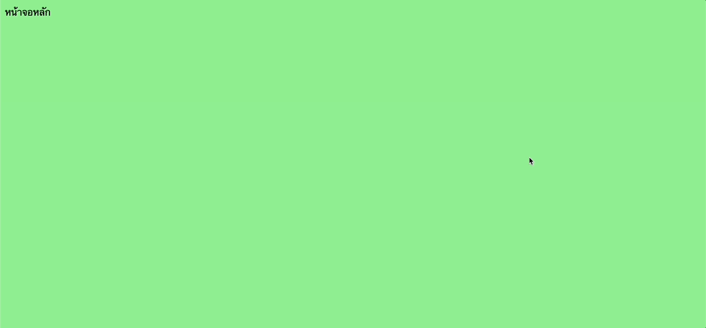
เคสแรกคือ
- ถ้าขนาดหน้าจอ desktop = ให้แสดงสีนำ้เงิน
- ถ้าขนาดหน้าจอน้อยกว่า 600px = ให้แสดงสีเขียว
code CSS ก็จะหน้าตาประมาณนี้
/* Default styles that apply to all devices */
body {
  background-color: lightblue;
}

/* Styles that apply to screens narrower than 600px */
@media only screen and (max-width: 600px) {
  body {
    background-color: lightgreen;
  }
}
ผลลัพธ์ที่ได้

เคสที่ 2 เราจะทำเหมือนเคสที่ 1 แต่กลับกัน
- ถ้าขนาดหน้าจอมากกว่า 600px = ให้แสดงสีเขียว
- ถ้าขนาดหน้าจออื่นๆ = ให้แสดงสีน้ำเงิน
/* Default styles that apply to all devices */
body {
  background-color: lightblue;
}

/* Styles that apply to screens narrower than 600px */
@media only screen and (max-width: 600px) {
  body {
    background-color: lightgreen;
  }
}
ผลลัพธ์ที่ได้
2. Fluid Layouts (flex) and Flexible Grid Systems (grid)
ในเคสของ Flex กับ Grid เองนั้นก็มีการ handle โดยใช้ breakpoint เข้ามาช่วยได้เช่นกัน โดยเราจะแบ่งออกเป็น 2 เคสคือ
Flexใช้สำหรับแบ่ง column ซ้ายขวา และให้เรียง column ใหม่เป็น column เดียวตอนเล็กลง (ในกรณีที��่จอเล็ก) = ใช้สำหรับ handle จำนวน column ตามขนาดหน้าจอGridใช้สำหรับแบ่ง row, column และให้เรียงเป็น row, column ใหม่ตามขนาดหน้าจอที่เล็กลง = ใช้สำหรับ handle พวก grid ที่ต้องการ handle ทั้ง column และ row ทั้ง grid ไปพร้อมๆกัน
เรามาดูทั้ง 2 เคสผ่าน code กัน
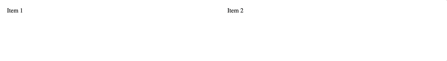
1. Flex สำหรับแบ่ง column แบบ responsive
เรามากำหนดโจทย์กันหน่อย
- สมมุติเรามี container ที่มี item แบ่งซ้ายขวา ออกจากกัน
- โดยเมื่อขนาดหน้าจอเล็กกว่า 768px = ให้จากแต่เดิมแบ่ง column ซ้ายขวา ให้มาเรียงเป็น column เดียวกันแทน
สิ่งนี้สามารถทำได้โดยการใช้สิ่งที่เรียกว่า flex-direction
flex-directionคือ การเรียง flex แบบใหม่ โดย default ของ flex คือจะทำการเรียงเป็น row (จากซ้ายไปขวา) มาเรียงใหม่เป็นตามที่ต้องการ�ได้ โดยเราจะมาเรียงใหม่เป็น column แทน (จากบนลงล่าง) แทน
ดูได้จากใน link นี้เพิ่มเติมเรื่อง flex-direction
https://css-tricks.com/snippets/css/a-guide-to-flexbox/
และนี่ก็คือ code ของโจทย์นี้
<html lang="en">
<head>
  <style>
    .container {
      display: flex;
    }

    .container .item {
      padding: 10px;
      flex: 1;
    }

    @media screen and (max-width: 768px) {
      .container {
        flex-direction: column;
      }
    }
  </style>
</head>
<body>
  <div class="container">
    <div class="item">Item 1</div>
    <div class="item">Item 2</div>
  </div>
</body>
</html>
ผลลัพธ์
2. Grid สำหรับแบ่ง row, column แบบ responsive
เรามากำหนดโจทย์กันหน่อยดีกว่า (โจทย์จะคล้ายๆกับ Flex)
- ถ้าเป็น desktop จะใช้ grid 3 columns
- ถ้าหน้าจอขนาดเล็กกว่า 768px จะใช้เป็น grid 2 columns
- ถ้าหน้าจอขนาดเล็กกว่า 640px จะใช้เป็น grid 1 column
ใน Grid จะมีสิ่งที่เรียกว่า grid-template-columns ในการกำหนดจำนวน column ใน grid ได้ โดยสามารถกำหนด ratio ได้ในแต่ละ column
เราจะใช้สิ่งนี้ในการ handle column ในแต่ละขนาดหน้าจอกัน และนี้ก็คือ code ของโจทย์นี้
<html lang="en">
<head>
  <style>
    .grid-container {
      display: grid;
      grid-template-columns: 1fr 1fr 1fr;
    }

    .grid-container .item {
      padding: 10px;
    }

    @media screen and (max-width: 768px) {
      .grid-container {
        grid-template-columns: 1fr 1fr;
      }
    }

    @media screen and (max-width: 640px) {
      .grid-container {
        grid-template-columns: 1fr;
      }
    }
  </style>
</head>
<body>
  <div class="grid-container">
    <div class="item">Item 1</div>
    <div class="item">Item 2</div>
    <div class="item">Item 3</div>
    <div class="item">Item 4</div>
    <div class="item">Item 5</div>
    <div class="item">Item 6</div>
  </div>
</body>
</html>
ผลลัพธ์
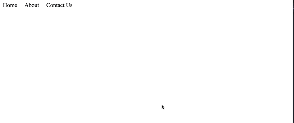
3. Navigation and menu
สำหรับเคสนี้เราจะมาลองทำตัวอย่าง Navbar menu กันโดย
- ฉบับ desktop จะโชว์เมนูแสดงทั้งหมดออกมาเป็นแนวนอน
- ฉบับ mobile (ขนาดหน้าจอน้อยกว่า 768px) จะโชว์เมนูออกมาเป็นแนวตั้ง และ ให้โชว์เมนูเมื่อเอาเมาส์มาวางบนเมนู
<html lang="en">
<head>
  <style>
    ul {
      list-style: none;
      margin: 0;
      padding: 0;
    }
    .desktop ul {
      display: flex;
    }
    .desktop ul > li {
      margin-right: 20px;
    }
    .mobile-menu,
    .mobile {
      display: none;
    }
    @media screen and (max-width: 768px) {
      .desktop {
        display: none;
      }
      .mobile-menu {
        display: block;
      }
      .mobile-menu:hover + .mobile {
        display: block;
      }
    }
  </style>
</head>
<body>
  <div class="desktop">
    <ul>
      <li>Home</li>
      <li>About</li>
      <li>Contact Us</li>
    </ul>
  </div>
  <div class="mobile-menu">Menu</div>
  <div class="mobile">
    <ul>
      <li>Home</li>
      <li>About</li>
      <li>Contact Us</li>
    </ul>
  </div>
</body>
</html>
ผลลัพธ์
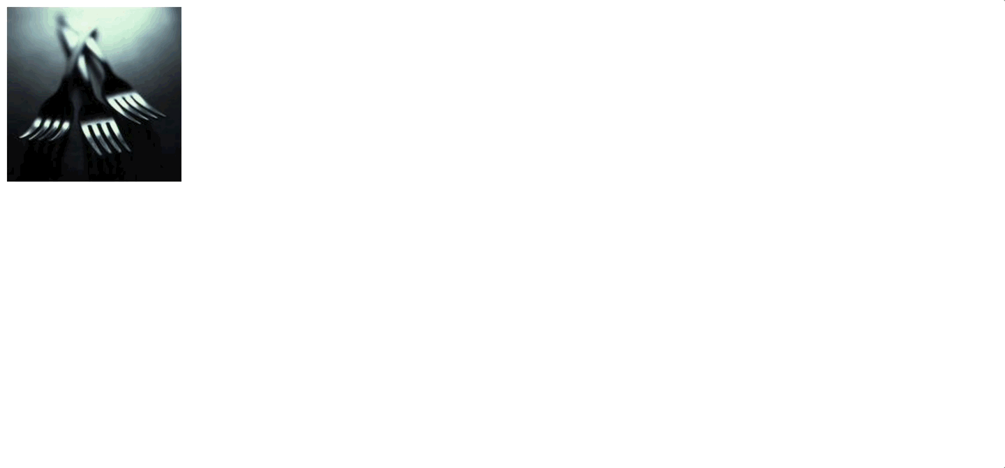
4. images and media
ใน html เองก็มี tag ที่สามารถจัดการภาพแบบ responsive ได้โดย
- มี tag
<picture>และสามารถแบ่งภาพแต่ละขนาดหน้าจอได้โดยใช้ tag<source>ได้
เช่นตาม code นี้
- ถ้าเป็น desktop เราจะใช้ภาพหนึ่ง
- ถ้าเป็น mobile (ขนาดหน้าจอน้อยกว่า 768px) จะใช้ภาพอีกภาพหนึ่งแทน
<picture>
  <source
    media="(max-width: 768px)"
    srcset="https://fastly.picsum.photos/id/883/200/200.jpg?hmac=evNCTcW3jHI_xOnAn7LKuFH_YkA8r6WdQovmsyoM1IY"
  >
  <img src="https://fastly.picsum.photos/id/23/200/200.jpg?hmac=IMR2f77CBqpauCb5W6kGzhwbKatX_r9IvgWj6n7FQ7c">
</picture>
ผลลัพธ์