การตกแต่ง CSS
Basic structure ของการแต่ง CSS
พื้นฐานของ CSS นั้นนอกจากจะจิ้มไปยังตัวที่ต้องการแต่งแล้ว ยังต้องระบุด้วยว่าเรากำลังจะแต่งอะไรเข้าไป
สิ่งที่อยู่ภายใน หลัง CSS Selector คือ object ที่ประกอบด้วย key และ value หน้าตาประมาณนี้
selector {
    /* ใส่สิง่ที่แต่งในนี้ */
    key: value
}
โดย
- key คือสิ่งที่เราต้องการจะเข้าไปแต่ง
- value คือค่าที่เราจะใส่สิ่งที่ต้องการจะแต่งสิ่งนั้นเข้าไป
ยกตัวอย่างเช่น css สำหรับการแต่งสี คือ color ดังนั้น
- key คือ color
- value คือ สีที่ต้องการจะเปลี่ยนเช่น blue
css ก็จะหน้าตาประมาณนี้
selector {
    /* ใส่สิง่ที่แต่งในนี้ */
    color: blue;
}
เราจะแบ่งประเภท CSS ออกเป็นทั้งหมด
ผมจะขอแนะนำ CSS ทั้งหมด 6 ตระกูลที่มีการใช้บ่อยๆ (ยังไม่ใช่ทั้งหมดของ CSS นะครับ) ซึ่งคำสั่งที่แนะนำนี้คือ key ที่ใช้สำหรับการตกแต่งของต่างๆใน html
เพื่อให้หน่วยที่ใช้เข้าใจง่ายๆก่อน ผมจะใช้หน่วย px (pixel) ทั้งหมด ซึ่ง px เป็นหน่วยความยาวบนหน้าจอคอมพิวเตอร์ (เดี๋ยวเราจะมาเจาะลึกเรื่องหน่วยอีกที)
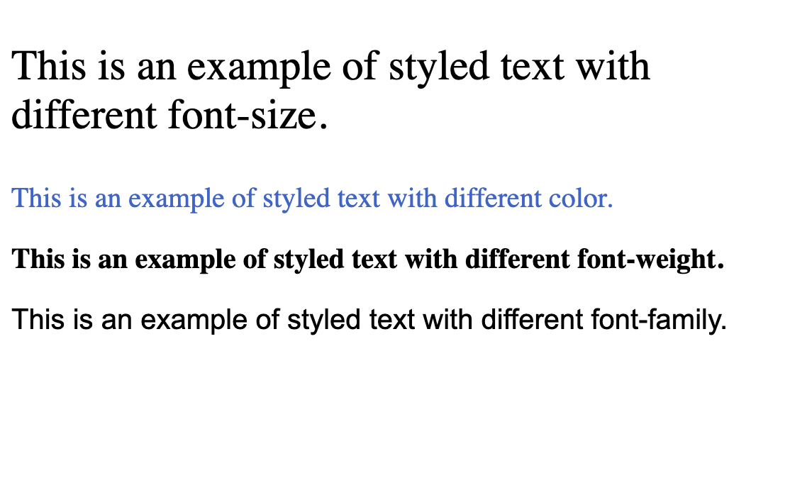
1. CSS Text styling
ตระกูลที่แต่งตัวอักษร ตัวที่มักจะใช้บ่อยๆ ประกอบไปด้วย
- font-size = ขนาดตัวอักษร
- color = สีตัวอักษร
- font-weight = ความหนาตัวอักษร
- font-family = เปลี่ยน Font เป็น Font อื่น
ตัวอย่าง ผมจะสร้าง tag p มา 4 ตัว id paragraph1 - paragraph4 โดย
id=paragraph1ให้ font-size ขนาด 24pxid=paragraph2ให้ color เป็นสี #3366ccid=paragraph3ให้ font-weight เป็นตัวเข้ม (bold)id=paragraph4ให้เปลี่ยน font เป็น Arial, sans-serif
ตัวอย่าง code
<!DOCTYPE html>
<html>
    <head>
        <title>Text Styling Example</title>
        <style>
            /* CSS styles for the first paragraph */
            #paragraph1 {
                font-size: 24px; /* Sets the font size to 24 pixels */
            }

            /* CSS styles for the second paragraph */
            #paragraph2 {
                color: #3366cc; /* Sets the text color to a shade of blue (#3366cc) */
            }

            /* CSS styles for the third paragraph */
            #paragraph3 {
                font-weight: bold; /* Makes the text bold */
            }

            /* CSS styles for the fourth paragraph */
            #paragraph4 {
                font-family: Arial, sans-serif; /* Specifies the font family to Arial, fallback to sans-serif if Arial is not available */
            }
        </style>
    </head>
    <body>
        <p id="paragraph1">This is an example of styled text with different font-size.</p>
        <p id="paragraph2">This is an example of styled text with different color.</p>
        <p id="paragraph3">This is an example of styled text with different font-weight.</p>
        <p id="paragraph4">This is an example of styled text with different font-family.</p>
    </body>
</html>
ผลลัพธ์จาก code ด้านบน
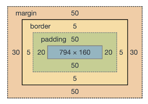
2. CSS Box model
ตระกูลที่แต่งกล่องของ CSS ในโลกของ HTML + CSS นั้นโดย default จะมอง HTML DOM (html tag 1 อัน) เป็นกล่อง 1 กล่อง (ตามภาพด้านล่างคือกล่องสีน้ำเงินที่อยู่ตรงกลาง) ซึ่งระบบของ CSS จะมีการแบ่ง space ออกจากกันเป็น 3 ส่วนคือ
- padding = ระยะห่างจากกล่อง html DOM โดยการขยาย"ภายใน"ออกไป (เมื่อใช้ padding = จะโดนนับว่าเป็นความสูงและความกว้างของกล่องในภาพรวมไปด้วย)
- border = เส้นกล่องที่จะมาขีดรอบกล่อง html DOM
- margin = ระยะห่างจากกล่อง html DOM โดยการขยาย"ภายนอก"ออกไป (จะไม่นับรวมเป็นความสูงและความกว้างของกล่อง เหมือนเป็นการผลัก space ออกจากกล่องไป)
ภาพประกอบ
โดยทั้ง 3 ตัวนี้จะสามารถเลือกข้าง up (บน), down (ล่าง), left (ซ้าย), right (ขวา) ได้ เช่น
- หากใช้เป็น
padding: 20px;จะถือว่าให้ space up ,down, left, right เป็น 20px หมด - แต่ถ้าใช้เป็น
padding-right: 20px;จะถือว่าเฉพาะด้านขวาเท่านั้นที่เพิ่มมา
จะขอยกตัวอย่างเพื่อให้เห็นภาพมากขึ้น
ตัวอย่าง สร้างกล่องขนาด 200px x 100px ขึ้นมา และระบายสีน้ำเงินไว้ โดย
- padding ให้เป็น 20px (รอบด้าน)
- margin ให้เป็น 30px (รอบด้าน)
- border ขนาด 2px ระบายสี
<!DOCTYPE html>
<html>
<head>
    <title>CSS Box Model Example</title>
    <style>
        /* CSS styles for the box */
        .box {
            width: 200px;
            height: 100px;
            background-color: blue;
            padding: 20px; /* Sets 20px padding around the content */
            margin: 30px; /* Sets 30px margin around the box */
            border: 2px solid #333; /* Creates a 2px solid border around the box */
        }
    </style>
</head>
<body>
    <!-- HTML content with the styled box -->
    <div class="box">This is a box with padding, margin, and border.</div>
</body>
</html>
ผลลัพธ์
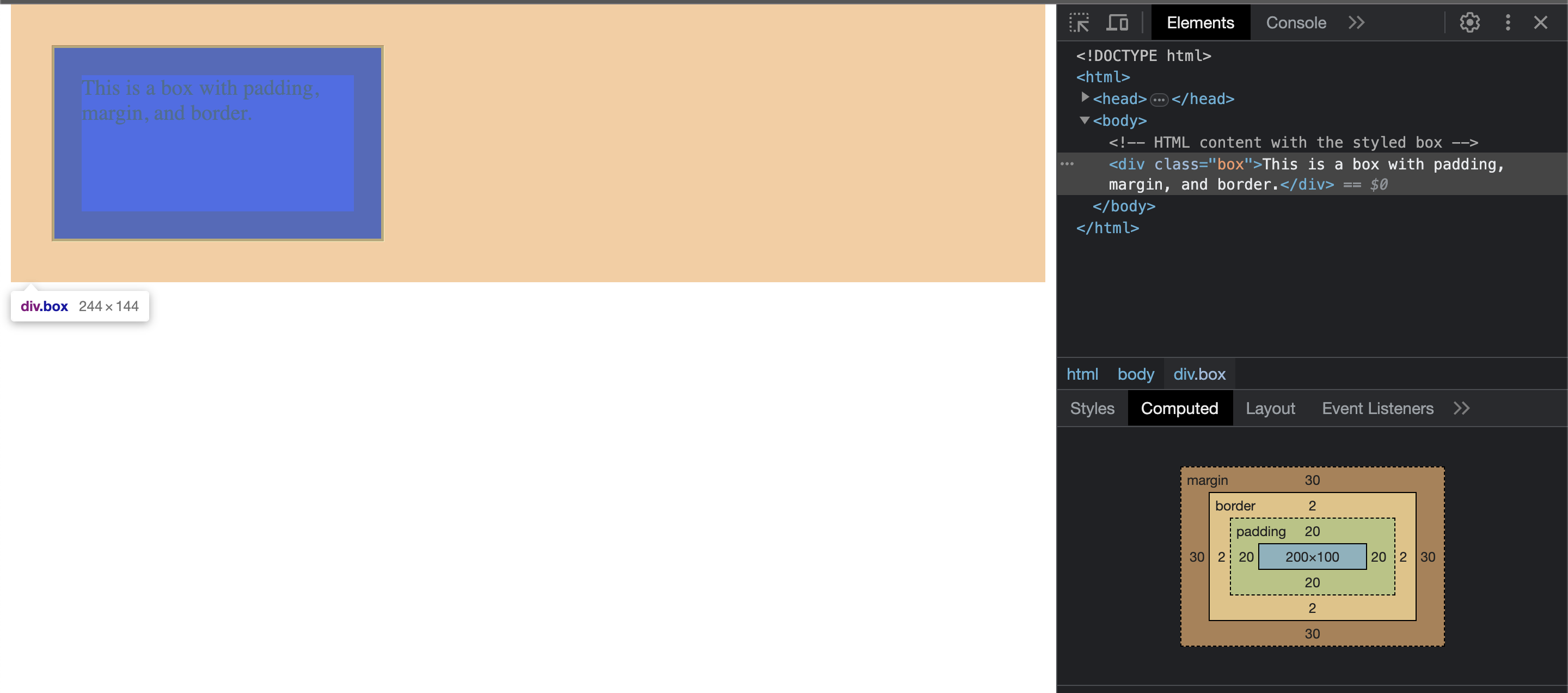
จะสังเกตเห็นว่า
- ตรงสีส้มคือ space ของ margin
- background-color จะไม่ระบายสีส่วนที่เป็น space ของ margin (แต่ระบายส่วน space ของ padding) = padding โดยมองเป็นส่วนหนึ่งของกล่องไป
เคสที่เหมาะสม
- margin เหมาะสำหรับเว้นระยะห่างระหว่างชิ้น เช่น เว้นระหว่างชิ้นบนกับชิ้นล่าง
- padding เหมาะสำหรับการจัดหน้าให้มี space ที่เหมาะสม เช่น ถ้า paragraph นี้ดูติดกันเกินไป อาจจะเพิ่ม space ในกล่อง เพื่อให้ระยะห่างเหมาะสมก็ได้ (และยังคงแต่ style ภายในกล่องเอาไว้)
3. CSS Layout
ตระกูลนี้ใช้สำหรับจัด layout หน้าจอ โดยแต่ละตัวจะมีความสามารถคือ
- block (เป็น default ของ div) ทำให้แต่ละชิ้นเป็นกล่องได้
- inline (เป็น default ของ span) ทำให้แต่ละชิ้นอยู่แถวเดียวกันได้
- flex จัด layout ใหม่ให้สามารถ control อยู่ใน grid แถวเดียวกันได้
- grid จัด layout ใหม่ให้สามารถ control row, column ตามต้องการได้
ผมจะแบ่งตัวอย่างออกจากกันเป็น 3 อัน
ตัวอย่างที่ 1 ใช้ block และ inline ร่วมกัน
<html>
<head>
    <title>Block and Inline Elements Example</title>
    <style>
        .block-element {
            display: block; /* This makes the element behave as a block-level element */
            background-color: #f0f0f0;
            padding: 10px;
            margin-bottom: 10px;
        }

        .inline-element {
            display: inline; /* This makes the element behave as an inline-level element */
            background-color: #eaeaea;
            padding: 5px;
            margin-right: 5px;
        }
    </style>
</head>
<body>
    <!-- HTML content with block and inline elements -->
    <div class="block-element">This is a block-level element.</div>
    <span class="inline-element">This</span>
    <span class="inline-element">is</span>
    <span class="inline-element">an</span>
    <span class="inline-element">inline-level</span>
    <span class="inline-element">element.</span>
</body>
</html>
ผลลัพธ์ของ code
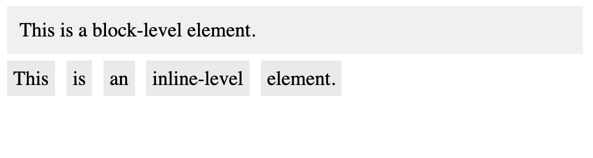
จะสังเกตเห็นว่า
- ถ้าใช้ display: block มันจะเว้นอยู่คนละบรรทัด เป็นบรรทัดเดียวไปเลย
- แต่พอใช้เป็น inline DOM จะสามารถวางอยู่ในบรรทัดเดียวกันได้
ตัวอย่างที่ 2 ใช้ flex
<html>
<head>
    <title>Flexbox Example</title>
    <style>
        /* CSS styles for the flex container */
        .flex-container {
            display: flex; /* This makes the container a flex container */
            justify-content: space-between;
        }

        /* CSS styles for the flex items (boxes) */
        .box {
            width: 100px;
            height: 100px;
            background-color: #f0f0f0;
            border: 1px solid #333;
        }
    </style>
</head>
<body>
    <!-- HTML content with the flex container and items -->
    <div class="flex-container">
        <div class="box">Box 1</div>
        <div class="box">Box 2</div>
        <div class="box">Box 3</div>
    </div>
</body>
</html>
ผลลัพธ์จาก code
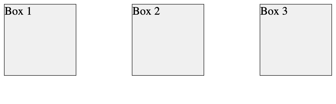
จะสังเกตเห็นว่า
- เราใช้ flex-container เป็น display: flex ส่งผลทำให้ตัวที่อยู่ภายในโดนจัด layout ใหม่ให้อยู่ในบรรทัดเดียวกัน (แม้ว่าตัวลูกด้านในจะเป็น block ก็ตาม)
- display: flex จะเป็นการเปลี่ยนภาพรวมของ layout ให้กลายเป็นแบบ flex และสามารถควบคุมแบบ flex ภายในแถวเดียวกันได้
- ส่วน
justify-content: space-between;เป็นการบอกว่า ถ้า space ระหว่างกล่องยังเหลืออยู่ (เช่น 1 แถวขนาด 740px แต่ทั้ง 3 กล่องมันกล่องล��ะ 100px แปลว่ามันจะเหลือพื้นที่ว่าง 440px) ให้เอา space ที่เหลือมาเว้นระหว่างกล่องด้วย - display: flex จะมีความยืดหยุ่นในการจัดการ item ภายในแถวเดียวกันมาก ซึ่งมันสามารถเปลี่ยนจากเรียงเป็น rows เปลี่ยนเป็น เรียงเป็น columns แทนก็ได้ หรือสามารถเปลี่ยนลำดับการเรียงใหม่ก็ได้เช่นกัน
สำหรับ Reference flex แนะนำให้ดูคัมภีตัวนี้เพิ่มเติม (มีเกือบครบทุก use case ของ flex)
ตัวอย่างที่ 3 ใช้ grid
<html>
<head>
    <title>Grid Example</title>
    <style>
        /* CSS styles for the grid container */
        .grid-container {
            display: grid; /* This makes the container a grid container */
            grid-template-columns: repeat(2, 150px); /* Two columns, each 150px wide */
            grid-gap: 10px; /* Gap between grid items */
        }

        /* CSS styles for the grid items */
        .item {
            background-color: #f0f0f0;
            padding: 20px;
            border: 1px solid #333;
        }
    </style>
</head>
<body>
    <!-- HTML content with the grid container and items -->
    <div class="grid-container">
        <div class="item">Item 1</div>
        <div class="item">Item 2</div>
        <div class="item">Item 3</div>
        <div class="item">Item 4</div>
    </div>
</body>
</html>
ผลลัพธ์จาก code
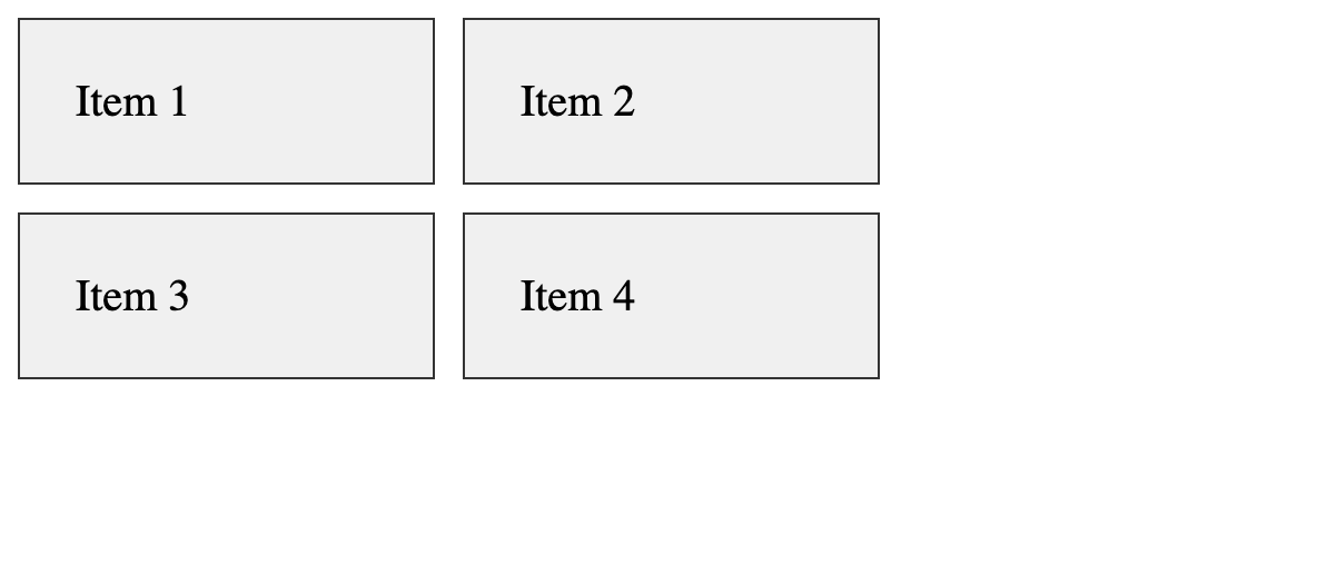
จะสังเกตเห็นว่า
- เราใช้ grid-container เปลี่ยนการแสดงผลเป็นแบบ grid
- โดย
grid-template-columns: repeat(2, 150px);คือบรรทัด��ที่บอกว่า เราจะ set 1 แถวให้มี 2 columns แต่ละ columns ขนาด 150px - ระยะห่างระหว่างช่องอยู่ที่ 10px
- เราก็จะเห็นผลลัพธ์ตามรูป ความแตกต่างของ flex คือ เมื่อ grid เจอว่า 1 แถวครบ 2 columns แล้วจะสามารถพามายังบรรทัดใหม่ได้ทันที (ซึ่ง flex จะสามารถเล่นภายใน column หรือ row นั้นได้แค่นั้น)
ความแตกต่างระหว่าง flex กับ grid ให้ดูจากวิธีจัด design ว่า
- ใน layout แถวนั้น กำลังเล่นกับเพียงแถวเดียวหรือไม่
- ถ้าใช่ = ใช้ flex จะจัดการง่ายกว่า
- ถ้าไม่ใช่ (เช่น แสดงผลลัพธ์การค้นหาแบบหลายแถว แถวละ 5 item) = ใช้ grid จะจัดการง่ายกว่า
- จริงๆ ทั้ง 2 ตัวสามารถใช้แทนกันได้เหมือนกัน แต่แต่ละตัวจะมีคุณสมบัติความยืดหยุ่นต่างกัน ใช้ถูกตามสถานการณ์จะทำให้เราไม่ต้องเขียน css เกินความจำเป็นได้
สำหรับ Reference grid แนะนำให้ดูคัมภีตัวนี้เพิ่มเติม (มีเกือบครบทุก use case ของ grid)
สำหรับ flex, grid แนะนำให้ลองเล่นบ่อยๆเพื่อให้เกิดความเคยชิน เนื่องจากเป็น css สำคัญที่ใช้หลักในโลกของการแต่ง style เลยก็ว่าได้ (ดูตัวอย่างจากในคลิป video หัวข้อหลักที่เล่นเพิ่มเติมได้เช่นกัน)
4. CSS Position
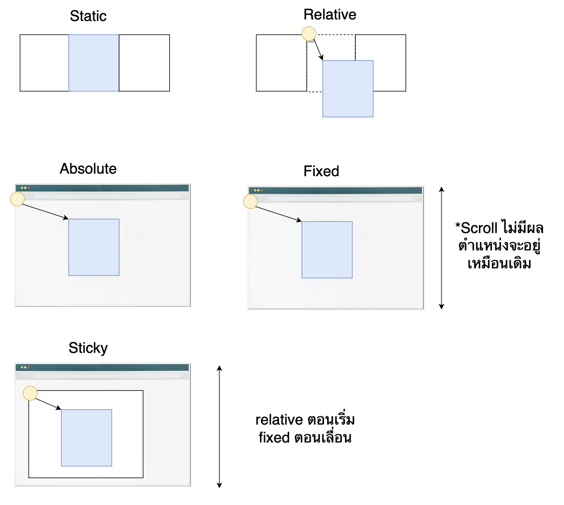
ตระกูลนี้คือการเล่นกับ Position ของสิ่งที่อยู่ใน html และหน้าจอ ซึ่งจะทำให้สามารถใช้ css ตัว top, down, left, rigth เพื่อกำหนด position ใหม่ของ DOM ได้ แต่ละอันมีคุณสมบัติดังนี้
- static = default คือ ไม่เล่นกับ position ใด
- relative = เล่นกับตำแหน่งปัจจุบันที่วางอยู่
- absolute = เล่นกับตำแหน่งของชิ้นแม่ของตัวเอง (ถ้าตัวแม่คือ body = เล่นกับตามตำแหน่งหน้าจอ)
- fixed = เล่นกับตำแหน่งหน้าจอทั้งหน้าจอ (และคาไว้แม้จะเลื่อนจอ)
- sticky = เล้นกับตำแหน่งปัจจุบันตอน DOM ถูกสร้างขึ้นมา, เมื่อกำลังพ้นหน้าจอ (relative) เปลี่ยนมาเล่นกับตำแหน่งหน้าจอแทน (fixed) เพื่อคาตำแหน่งเอาไว้
ซึ่ง css ทั้ง 4 ตัวที่เพิ่มมา top, left, right, bottom คือตำแหน่งที่จะเปลี่ยนไปเมื่อเทียบกับตำแหน่ง reference เพื่อความเข้าใจที่ดีขึ้น ผมจะขออธิบายไปพร้อมกับ code
ตัวอย่าง position
<html>
<head>
<title>Positioning Example</title>
<style>
/* CSS styles for static positioning */
.static {
position: static;
background-color: #f0f0f0;
padding: 10px;
border: 1px solid #333;
}
/* CSS styles for relative positioning */
.relative {
position: relative;
top: 20px;
left: 20px;
background-color: #f0f0f0;
padding: 10px;
border: 1px solid #333;
}
/* CSS styles for absolute positioning */
.absolute-container {
position: relative;
height: 300px;
}
.absolute {
position: absolute;
top: 50px;
left: 50px;
background-color: #f0f0f0;
padding: 10px;
border: 1px solid #333;
}
/* CSS styles for fixed positioning */
.fixed {
position: fixed;
top: 50px;
right: 50px;
background-color: #f0f0f0;
padding: 10px;
border: 1px solid #333;
}
/* CSS styles for sticky positioning */
.sticky {
position: sticky;
top: 50px;
background-color: #f0f0f0;
padding: 10px;
border: 1px solid #333;
}
/* Additional styles for visualization purposes */
body {
margin: 0;
padding: 20px;
height: 1500px;
}
</style>
</head>
<body>
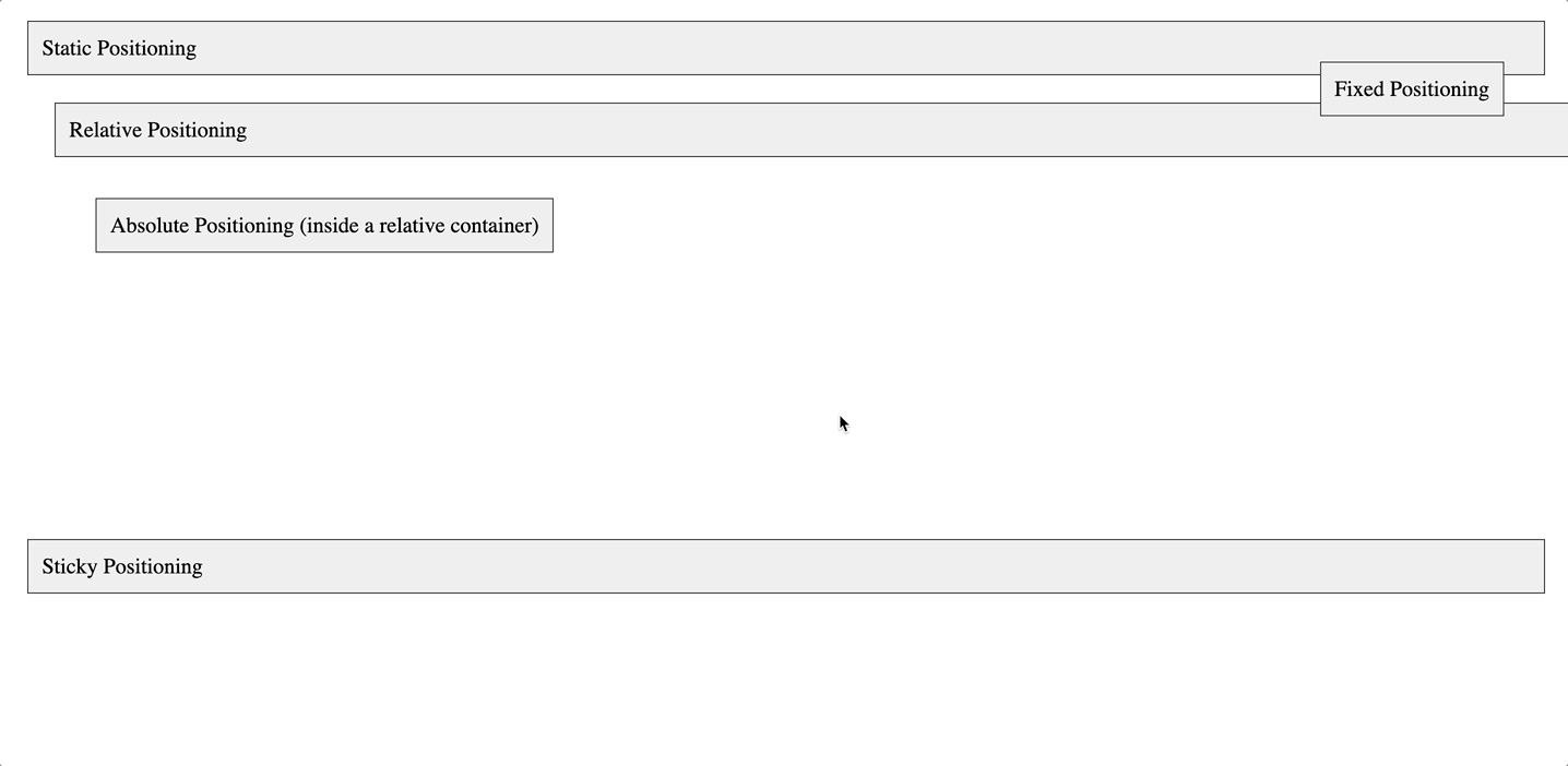
<!-- HTML content with elements using different positioning -->
<div class="static">Static Positioning</div>
<div class="relative">Relative Positioning</div>
<div class="absolute-container">
<div class="absolute">Absolute Positioning (inside a relative container)</div>
</div>
<div class="fixed">Fixed Positioning</div>
<div class="sticky">Sticky Positioning</div>
</body>
</html>
อธิบายทีละตัว
- position static ก็ไม่มีอะไรอยู่ตำแหน่งเดิม
- position relative (ตามภาพด้านล่างนี้) ให้ลองนึกภาพว่ามันคือกล่องที่ต่อจากชิ้นของ Position static แต่ถูกผลักจากตำแหน่งเดิมมา การใช้ top, right, left, bottom คือการบอกว่า "ผลักจากตำแหน่งเดิมที่เคยอยู่ออกไปเท่าไหร่ ?" ตามตัวอย่าง code นี้
top: 20px;= ผลักจากตำแหน่งบนมา 20pxleft: 20px;= ผลักจากตำแหน่งด้านซ้ายไป 20px- สังเกตตรงขวาล่าง จะมีกรอบนอกสุด (นอก margin) เป็นการบอก position ว่า position เคลื่อนจากตำแหน่งเดิมไปเท่าไหร่
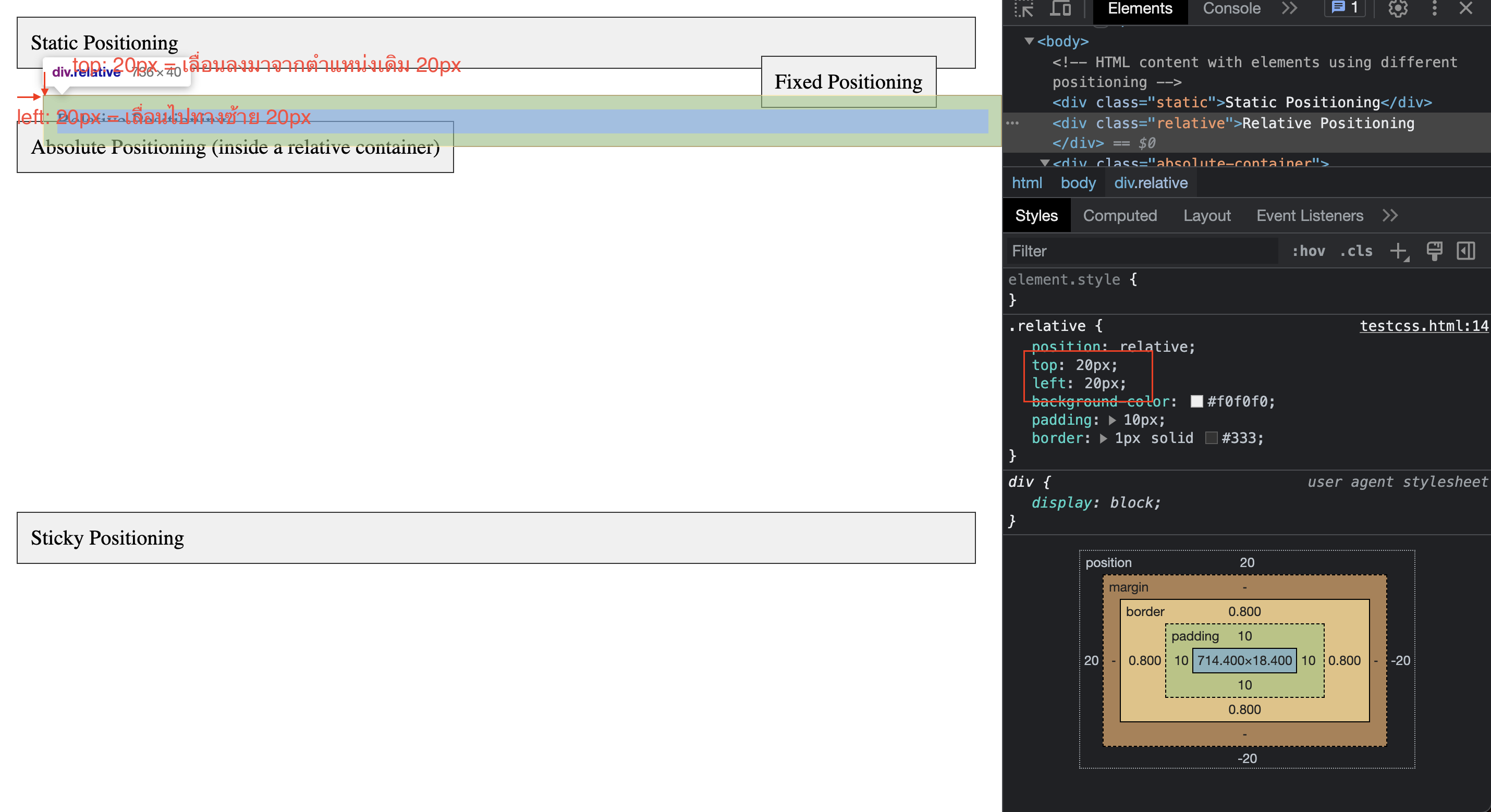
-
position absolute (ตามภาพด้านล่างนี้) คือการผลักจากตำแหน่งของตัว parent (ปกติผมจะเรียกแบบบ้านๆว่าตัวแม่ หรือ ตัวที่ห่อ html DOM ตัวนี้อยู่) เช่น ตามภาพนี้
- กรอบสีน้ำเงินคือขนาดของ div absolute-container
- div absolute ตัวลูกมีการ set top: 50px, left: 50px; เท่ากับว่า มีการผลักจากด้านบนมา 50px และด้านซ้ายไป 50px (จากตำแหน่งของ parent) ออกไป
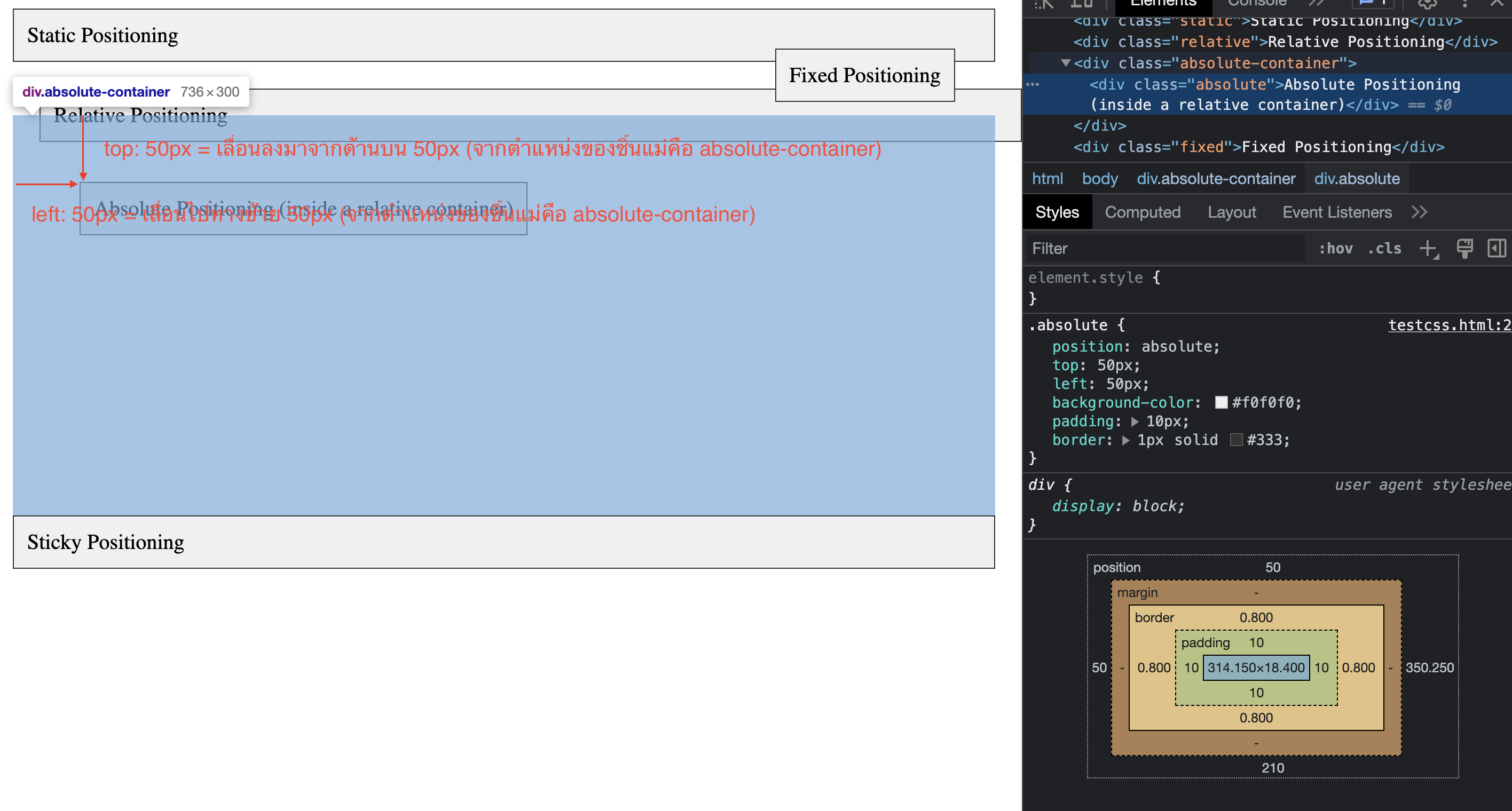
-
position fixed
- สำหรับผม fix คือการ set ตำแหน่งหน้าจอเลยว่าจะอยู่ตรง top, bottom, right, left ตรงไหนของหน้าจอ
- ตามตัวอย่าง div fixed set ไว้เป็น top: 50px, right: 50px = จากตำแหน่งหน้าจอ browser เลื่อนลงมา 50px และเลื่อนจากทางขวามา 50px (แสดงตำแหน่งออกมาตามรูป) โดยไม่ขึ้นอยู่กับตำแหน่งที่วางอยู่เลยว่าจะอยู่ตรงไหน
- และสังเกตตาม video ด้านล่าง เมื่อเราเลื่อน scroll ลงมา fixed จะยังคงอยู่ตำแหน่งเดิมเสมอ
-
position sticky
- จะแตกต่างกันตรงที่ตอนที่เริ่มใช้งาน ตำแหน่งจะยังคงอยู่ตำแหน่งเดิม
- แต่เมื่อเลื่อนหน้าจอมาถึงตำแหน่งที่ top: 50px จะคาไว้ที่ตำแหน่ง top: 50px แบบนั้นเรื่อยๆจนจบหน้าจอ
- sticky ตอนเริ่มต้นจะ set position เป็น relative ตามปกติ และจะทำงานเมื่อเลื่อนหน้าจอแล้ว (จะแตกต่างกับ fixed ตรงที่มันจะคาอยู่ตั้งแต่แรกแล้ว)
Position นั้นจะมีประโยชน์ในการจัดการพวกของที่ต้องซ้อนกัน หรือต้องจัดการเฉพาะ item นั้น จะไม่เหมือนกับ layout ที่จะเล่นกับหน้าจอ หรือทั้งแถว
และเช่นเดิม ถ้าอ่านแล้วยังงงๆอยู่ ขอแนะนำให้ดู video ของ Session นี้เพิ่มเติม (ข้ามไปตรงหัวข้อ Position ได้) ในนั้นจะมีตัวอย่างเพิ่มเติมไว้เช่นกัน
5. CSS float wrap text
ตระกูลนี้จะช่วยทำให้ DOM มีความสามารถท�ำให้ชิ้นนั้น "ลอยขึ้นมาได้" เหมาะกับเคสที่ไม่ต้องการเพิ่มพวก display ไป แต่ยังให้สามารถมีคุณสมบัติทั้ง 2 ชิ้นลอยและไหลตามกันไปได้
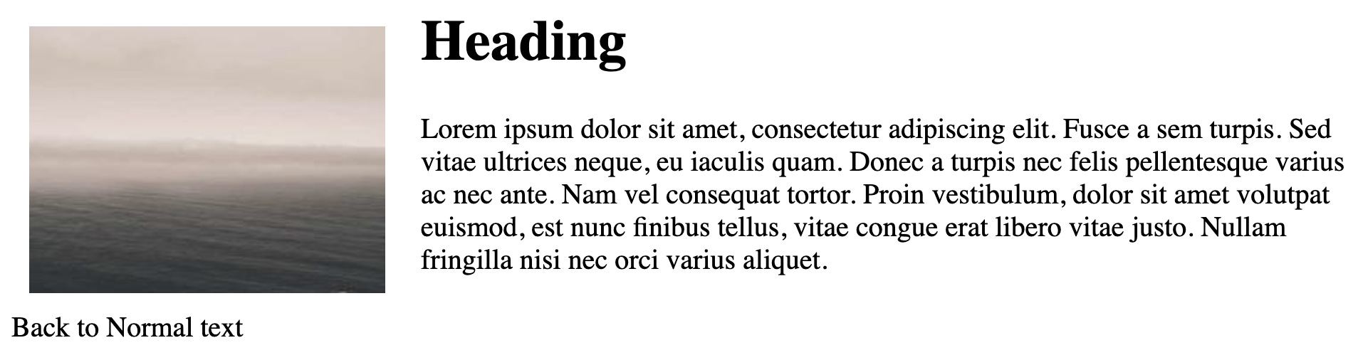
ตัวอย่าง ใช้ float กับ การเอาภาพวางไว้ทางซ้าย
<html>
<head>
    <title>Float Image and Text Example</title>
    <style>
        /* CSS styles for the floated image */
        .left-float {
            float: left;
            width: 200px;
            height: 150px;
            margin: 10px;
        }

        /* CSS styles for the text on the right */
        .text-on-right {
            margin-left: 230px; /* Creates space for the floated image on the left */
        }

        .clear {
          clear: both;
        }
    </style>
</head>
<body>
    <!-- HTML content with floated image and text on the right -->
    <img class="left-float" src="https://fastly.picsum.photos/id/279/200/200.jpg?hmac=K-uW0woYRqVG_0bwZHp7tqD0lhiHByJ2DubSU4TIew4" alt="Example Image">
    <div class="text-on-right">
        <h1>Heading</h1>
        <p>Lorem ipsum dolor sit amet, consectetur adipiscing elit. Fusce a sem turpis. Sed vitae ultrices neque, eu iaculis quam. Donec a turpis nec felis pellentesque varius ac nec ante. Nam vel consequat tortor. Proin vestibulum, dolor sit amet volutpat euismod, est nunc finibus tellus, vitae congue erat libero vitae justo. Nullam fringilla nisi nec orci varius aliquet.</p>
    </div>
    <div class="clear"></div> <!-- Clearing element -->
    <div>Back to Normal text</div>
</body>
</html>
ผลลัพธ์จาก code
6. CSS Image
<!DOCTYPE html>
<html>
<head>
<title>Background Image Example</title>
<style>
/* CSS styles for the background image */
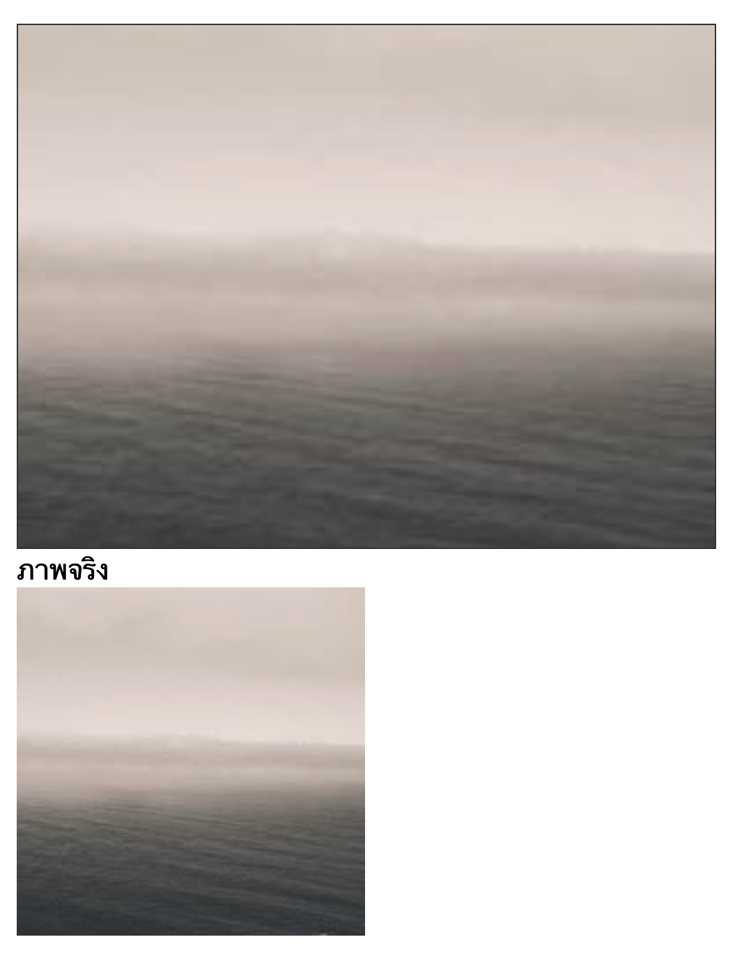
.background-image {
background-image: url('https://fastly.picsum.photos/id/279/200/200.jpg?hmac=K-uW0woYRqVG_0bwZHp7tqD0lhiHByJ2DubSU4TIew4');
background-size: cover; /* Scale the image to cover the entire container */
background-position: center; /* Position the image at the center of the container */
background-repeat: no-repeat; /* Prevent the image from repeating */
width: 400px;
height: 300px;
border: 1px solid #333;
}
/* Additional styles for visualization purposes */
body {
margin: 0;
padding: 20px;
}
</style>
</head>
<body>
<!-- HTML content with the element having the background image -->
<div class="background-image"></div>
<div>ภาพจริง</div>
<img src="https://fastly.picsum.photos/id/279/200/200.jpg?hmac=K-uW0woYRqVG_0bwZHp7tqD0lhiHByJ2DubSU4TIew4">
</body>
</html>
ผลลัพธ์ของ code
เพิ่มเติม
ตระกูลที่ผมแนะนำไปนี้นั้น จะไม่ครอบคลุมทุกคำสั่ง css นะครับ เนื่องจากคำสั่ง CSS เยอะมาก ��แต่สำหรับตัวที่ผมเล่ามานั้น เพียงพอสำหรับทำเคสส่วนใหญ่ของเว็บไซต์ได้แล้ว
มันก็จะเป็น case by case ที่ไม่ได้ใส่ไป เช่น ขีดเส้นไต้, animation (ที่เดี๋ยวผมจะเล่าเพิ่มเติมอีกที)
Reference เพิ่มเติมสำหรับ css สำหรับคนที่สนใจศึกษาเพิ่มเติม