ลอง Daisy UI Component
มาลองเล่น DaisyUI Component
Document ต้นฉบับ https://daisyui.com/components/
สิ่งที่เราจะทำกันในหัวข้อ�นี้ เราจะมาลองบางส่วนของ DaisyUI เพื่อให้เห็นภาพการใช้งานมากขึ้น ก่อนจะกลับไปแต่ง Todo list กัน
1. Action
set component ที่เล่นเกี่ยวกับ click action ซึ่งก็จะมีตั้งแต่ Button, Dropdown, Modal (popup แบบคลิกขึ้นมา), Swap (หรือ Toggle)
มาลองดูตัวอย่างกัน
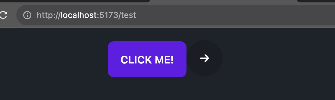
- สร้าง button style primary color
- สร้าง button ที่บรรจุ icon arrow icon เอาไว้ เป็นแบบวงกลม
code
<!-- Button -->
<button class="btn btn-primary">Click me!</button>

<!-- Icon button -->
<button class="btn btn-circle btn-icon">
  <svg style="fill: white;" xmlns="http://www.w3.org/2000/svg" height="1em" viewBox="0 0 448 512"><!--! Font Awesome Free 6.4.2 by @fontawesome - https://fontawesome.com License - https://fontawesome.com/license (Commercial License) Copyright 2023 Fonticons, Inc. --><path d="M438.6 278.6c12.5-12.5 12.5-32.8 0-45.3l-160-160c-12.5-12.5-32.8-12.5-45.3 0s-12.5 32.8 0 45.3L338.8 224 32 224c-17.7 0-32 14.3-32 32s14.3 32 32 32l306.7 0L233.4 393.4c-12.5 12.5-12.5 32.8 0 45.3s32.8 12.5 45.3 0l160-160z"/></svg>
</button>
ผลลัพธ์ของ code นี้
2. Data display
set component เกี่ยวกับการแสดงผลส่วนของ data ให้สวยงามขึ้น เช่น
- Badge (แสดง label)
- Alert (แสดงส่วนข้อความแจ้งเตือน success, error)
- Table (แสดงตารางให้สวยงามขึ้น)
- Card (แสดง data style เหมือน card)
- Carousel (ภาพแบบเลื่อน)
- Countdown (ตัวนับถอยหลัง)
- Tooltip (ตัวที่ hover แล้วแสดง��ออกมา) และอื่นๆที่เกี่ยวกับการแสดงผลข้อมูล จะอยู่ในหมวดนี้หมด (ดูได้ตรงหัวข้อ Data display ใน DaisyUI)
เราลองมาดูตัวอย่างกัน โดยเราจะทำทั้งหมด 2 อย่างคือ
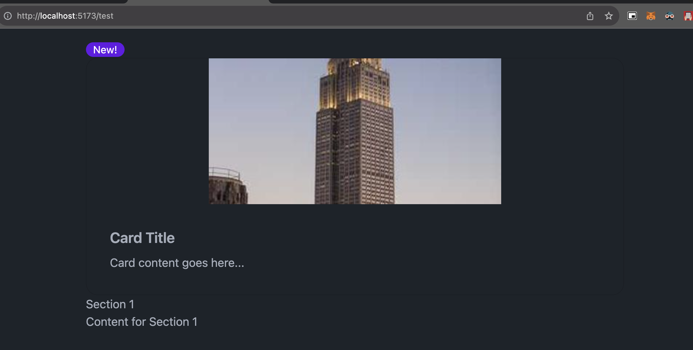
- สร้าง Badge เป็นแบบ primary ข้อความ "News!"
- สร้าง Card เป็นแบบ วงกลม และมี Title และ description อยู่ในนั้น
- สร้าง Accordion เมนูสำหรับเปิดปิด คล้ายๆ FAQ
<!-- Badge -->
<span class="badge badge-primary">New!</span>

<!-- Card -->
<div class="card bordered">
  <figure>
    <img src="https://fastly.picsum.photos/id/736/400/200.jpg?hmac=XD5Nff_to0eS8sGJCmQfhhDclEGt_TvmHVHSEIqPlqk">
  </figure>
  <div class="card-body">
    <h2 class="card-title">Card Title</h2>
    <p>Card content goes here...</p>
  </div>
</div>

<!-- Accordion -->
<div class="accordion">
  <input id="accordion-1" type="checkbox" class="hidden">
  <label class="accordion-header" for="accordion-1">
    Section 1
  </label>
  <div class="accordion-body">
    Content for Section 1
  </div>
</div>
ผลลัพธ์ของ code นี้
3. Data Input
set component เกี่ยวกับ Input form ก็จะประ��กอบไปด้วย
- Checkbox
- File input (สำหรับ upload file)
- Radio
- Range (slider สำหรับเลื่อนเพื่อเลือกตัวเลข)
- Rating (แสดง Rating โดยการกด = การ input ตัวเลข)
- Select
- Text input
- Textarea
- Toggle (สำหรับกด ปิด / ปิด)
เรามาลองดูตัวอย่างผ่าน code กัน เราจะลองสร้าง 2 อย่างขึ้นมา
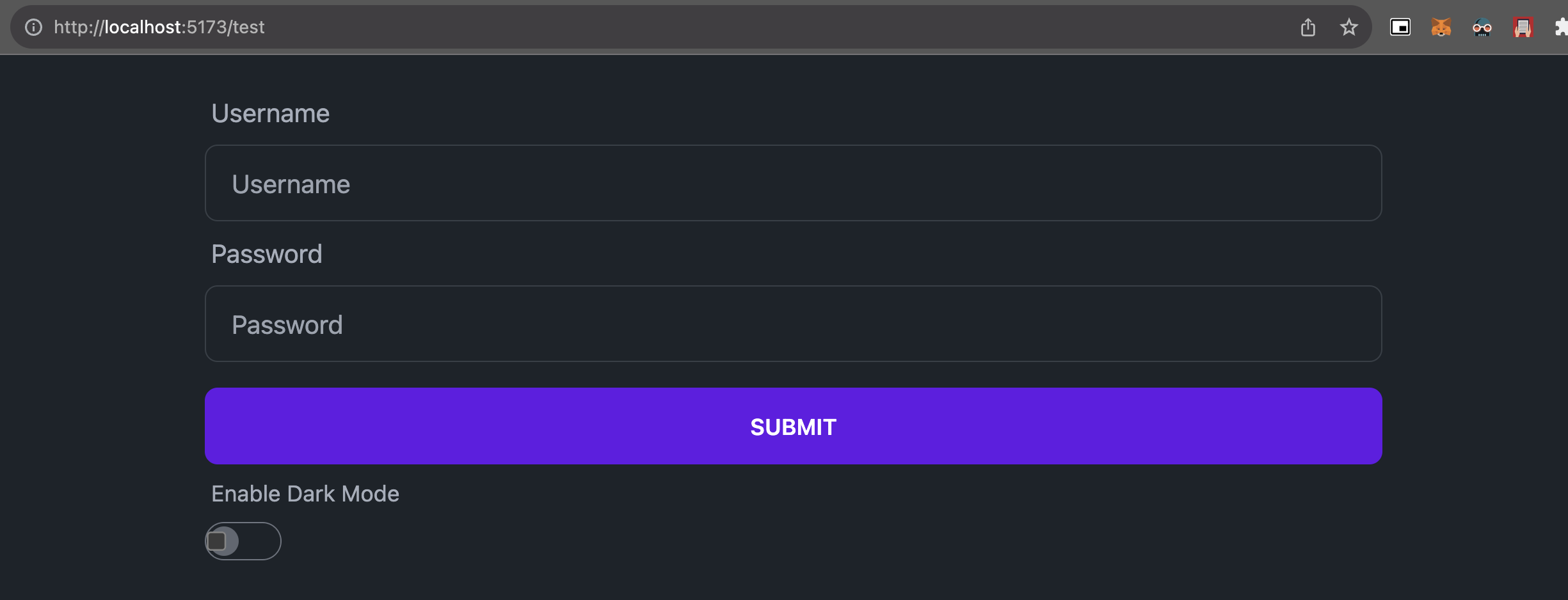
- สร้าง Form ที่สามารถกรอก username, password พร้อมปุ่ม Submit
- สร้าง Toggle switch สำหรับเปิด / ปิด Dark mode
<!-- Form -->
<form>
  <div class="form-control">
    <label class="label">Username</label>
    <input type="text" class="input input-bordered" placeholder="Username">
  </div>
  <div class="form-control">
    <label class="label">Password</label>
    <input type="password" class="input input-bordered" placeholder="Password">
  </div>
  <div class="form-control mt-4">
    <button type="submit" class="btn btn-primary">Submit</button>
  </div>
</form>

<!-- Toggle switch -->
<div class="form-control">
  <label class="label">
    <span class="label-text">Enable Dark Mode</span>
  </label>
  <label class="toggle">
    <input type="checkbox">
    <span class="toggle-mark"></span>
  </label>
</div>
ผลลัพธ์ของ code นี้
4. Layout
set component สำหรับแสดงผลส่วน Layout แบบเพิ่มเติม (จะเพิ่มเติมจากการใช้ flex, grid ทั่วๆไป) ซึ่งจะเป็นส่วนที่เจอบ่อยในเว็บ
ก็จะมีตั้งแต่
- Artboard (แผ่นสำหรับแสดงผล)
- Divider (เส้นแบ่ง)
- Drawer (เมนู Sidebar)
- Footer (เมนูส่วนล่าง)
- Hero (เมนูใหญ่ส่วนบน)
- Indicator (ตัวชี้ด้านบน)
- Join (กลุ่มของเมนู)
- Mask (สำหรับ Mask ภาพให้เป็นตาม layout ที่ต้องการ)
- Stack (ของซ้อนกัน)
- Toast (เมนูชั่วคราวที่ขึ้นตรงมุมจอ)
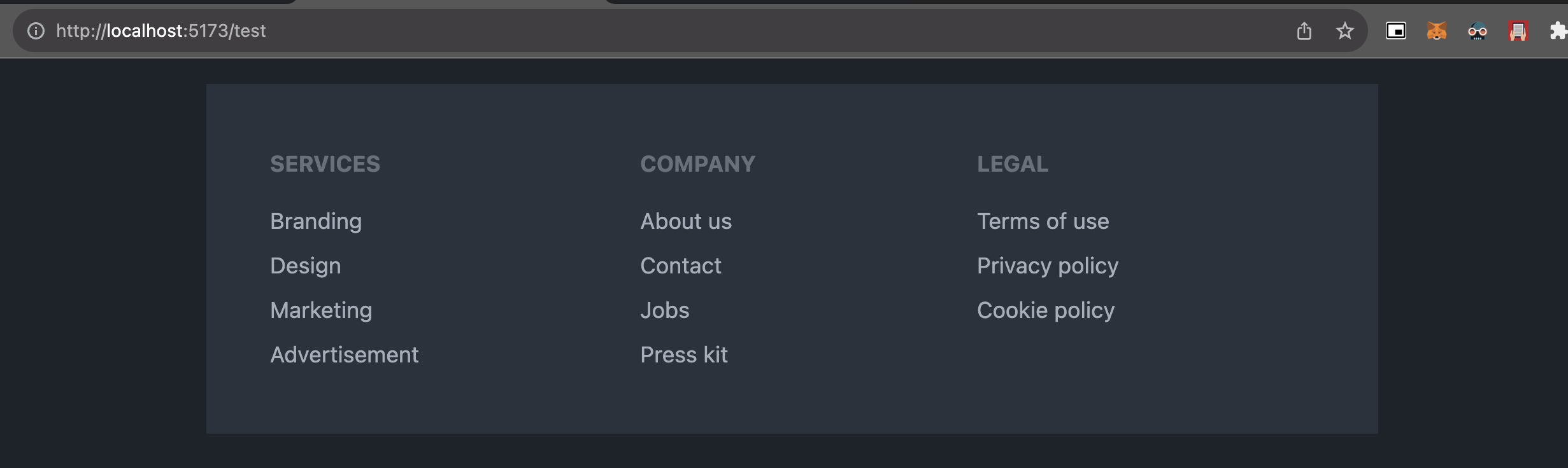
ตัวอย่าง code นี้คือการสร้าง footer
<!-- Footer -->
<footer class="footer p-10 bg-neutral text-neutral-content">
  <nav>
    <header class="footer-title">Services</header>
    <a class="link link-hover">Branding</a>
    <a class="link link-hover">Design</a>
    <a class="link link-hover">Marketing</a>
    <a class="link link-hover">Advertisement</a>
  </nav>
  <nav>
    <header class="footer-title">Company</header>
    <a class="link link-hover">About us</a>
    <a class="link link-hover">Contact</a>
    <a class="link link-hover">Jobs</a>
    <a class="link link-hover">Press kit</a>
  </nav>
  <nav>
    <header class="footer-title">Legal</header>
    <a class="link link-hover">Terms of use</a>
    <a class="link link-hover">Privacy policy</a>
    <a class="link link-hover">Cookie policy</a>
  </nav>
</footer>
ผลลัพธ์ของ code นี้
5. Navigation
set component เกี่ยวกับการนำทาง Link ในแต่ละรูปแบบ ก็จะมีตั้งแต่
- Breadcrumbs (ตัวช่วยนำทาง user ในเว็บไซต์ ส่วนแสดงว่าอยู่หน้าไหน)
- Bottom navigation (ส่วน menu ด้านล่างที่กดเปลี่ยนได้)
- Link (link ปกติ)
- Menu (แสดงเมนู สำหรับ link ไปหน้าอื่น)
- Navbar (ส่วนแสดงเมนูด้านบน)
- Pagination (ตัวเลขหน้า)
- Steps (step แต่ละขั้นที่มักจะโชว์ในพวกที่มีหลายขั้นตอนในหน้าเดียว)
- Tab (tab แยกเมนูด้านบน)
มาดูตัวอย่างผ่าน code กัน
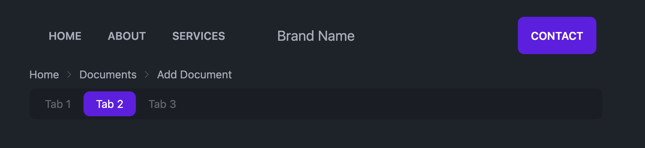
- สร้าง Navbar ตัวอย่างพร้อมปุ่ม Contact
- สร้าง Breadcrumbs ตัวอย่าง
- สร้าง Tab ตัวอย่าง
<!-- Navbar -->
<div class="navbar">
  <div class="navbar-start">
    <a href="#" class="btn btn-ghost">Home</a>
    <a href="#" class="btn btn-ghost">About</a>
    <a href="#" class="btn btn-ghost">Services</a>
  </div>
  <div class="navbar-center">
    <span class="text-lg">Brand Name</span>
  </div>
  <div class="navbar-end">
    <a href="#" class="btn btn-primary">Contact</a>
  </div>
</div>

<!-- Breadcrumbs -->
<div class="text-sm breadcrumbs">
  <ul>
    <li><a>Home</a></li>
    <li><a>Documents</a></li>
    <li>Add Document</li>
  </ul>
</div>

<!-- Tabs -->
<div class="tabs tabs-boxed">
  <a class="tab">Tab 1</a>
  <a class="tab tab-active">Tab 2</a>
  <a class="tab">Tab 3</a>
</div>
ผลลัพธ์ของ code นี้
และนี่คือ Component โดยประมาณของ DaisyUI (เดี๋ยวเราจะมีพาเล่นตลอด Session แต่ง UI อีกแน่นอน)
รู้จักกับ Theme
Document ต้นฉบับ https://daisyui.com/docs/themes/
แน่นอน เว็บทุกเว็บมี style เป็นของตัวเอง และเช่นเดียวกันกับ DaisyUI ที่สามา�รถกำหนด Theme หรือ set ของ style ที่ต้องการออกมาได้
โดยปกติ DaisyUI นั้นจะมี Theme ทั้งหมด 2 แบบคือ
- Predefined Themes Theme ที่ Daisy UI ได้ทำไว้ให้แล้ว เช่น light, dark, forest, rose ซึ่งสามารถกำหนดการใช้ theme ผ่าน config ได้เลย ใน
tailwind.config.js
เช่น ถ้าเราจะใช้งาน theme cupcake (ที่มีอยู่แล้ว) ที่ tailwind.config.js
เราจะทำการ import theme เข้ามาใน daisyui
module.exports = {
  //...
  daisyui: {
    themes: ["cupcake"],
  },
}
แล้วที่ tag <html> ให้เพิ่ม theme ที่จะใช้ไปแบบนี้
<html data-theme="cupcake"></html>
ก็จะสามารถเปลี่ยนทั้งเว็บให้เป็น theme นั้นได้
- Custom Theme เราสามารถเพิ่ม theme เองตามที่ต้องการได้เช่นเดียวกัน
เช่น ��ถ้าเราต้องการเพิ่ม mytheme เข้าไปใน daisyUI ก็สามารถเพิ่มได้จาก tailwind.config.js เช่นเดียวกัน
module.exports = {
  //...
  daisyui: {
    themes: [
      {
        mytheme: {
          "primary": "#a991f7",
          "secondary": "#f6d860",
          "accent": "#37cdbe",
          "neutral": "#3d4451",
          "base-100": "#ffffff",
          "--rounded-box": "1rem", // border radius rounded-box utility class, used in card and other large boxes
          "--rounded-btn": "0.5rem", // border radius rounded-btn utility class, used in buttons and similar element
          "--rounded-badge": "1.9rem", // border radius rounded-badge utility class, used in badges and similar
          "--animation-btn": "0.25s", // duration of animation when you click on button
          "--animation-input": "0.2s", // duration of animation for inputs like checkbox, toggle, radio, etc
          "--btn-text-case": "uppercase", // set default text transform for buttons
          "--btn-focus-scale": "0.95", // scale transform of button when you focus on it
          "--border-btn": "1px", // border width of buttons
          "--tab-border": "1px", // border width of tabs
          "--tab-radius": "0.5rem", // border radius of tabs
        },
      },
      "dark",
      "cupcake",
    ],
  },
}
ซึ่งอย่างที่เห็น มันสามารถ custom ได้หมดตั้งแต่สีถึงขนาดของแต่ละจุด และวิธีใช้ก็เหมือนกัน
<html data-theme="mytheme"></html>
และสามารถเพิ่ม custom css ให้กับ theme ได้เช่นกัน เช่นแบบนี้
[data-theme="mytheme"] .btn {
  border-width: 2px;
  border-color: black;
}
ซึ่งใน Course นี้ เดี๋ยวเราจะหยิบ Predefined Theme มาใช้กัน นะครับ เดี๋ยวเราจะมาเลือกสัก theme สำหรับการแต่งกัน